
Designing for Discovery: How to Reduce Decision Fatigue in Streaming Apps
StreamPlay simplifies modern entertainment by bringing live channels, on-demand videos, highlights, and personalized recommendations into one unified platform. Instead of endlessly switching between multiple apps, users can easily discover and start watching content in a smooth, consistent experience—making media consumption faster and less frustrating.

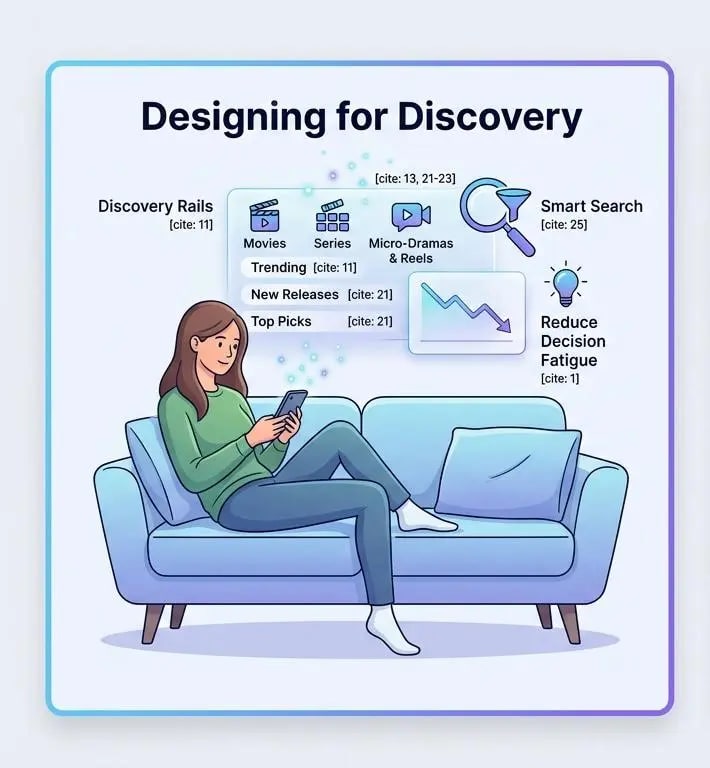
Table of contents
Introduction
People these days can pick from so many shows and videos right on their phones or whatever, but half the time it just turns into this endless scrolling thing where you cant decide on anything. It gets frustrating, you know. I think the whole point of better entertainment coming up is to pull all those separate apps together into something smoother, instead of bouncing around everywhere.
StreamPlay tries to fix that by making it easy to go from just wondering what to watch to actually starting it, without all the hassle. Its set up as this main spot where you discover stuff, like live channels or videos you can watch anytime, plus those quick highlights and suggestions based on categories, all in the same place that looks consistent. A unified thing like an OTT aggregator, it changes how we take in media, or at least thats how it seems.
Browse By Apps: All Your Subscriptions in One PlaceS
People get really annoyed with streaming because everything is so scattered, you know, like you have to jump between apps and sites just to find what you want. StreamPlay kind of fixes that by pulling together movies, shows, short reels, all that stuff into one spot, so the switch from looking around to actually watching feels a lot smoother.
It seems like instead of dealing with a bunch of open tabs, you can just browse stuff from big services, Prime Video or JioHotstar, ZEE5, LionsGate Play, Apple TV+, FanCode, HBO Max, Sony LIV, things like that, right there in the same place. They set it up with these rails for discovery, sections based on whats trending.
Some picked highlights, which makes it easy to check out options without hunting everywhere.
* Users get a sense right away of whats available since movies, series, reels, and live programming are sorted into clear groups. That kind of setup orients you fast, especially if youre new to the app.
* When it comes to comparing different titles, collections pull things together by genre, tone, or even the cast involved, and they consider audience suitability too. You dont have to click around endlessly to see options side by side. It seems like that makes decisions quicker, though sometimes the groupings overlap a bit.
* Browsing works smoothly across devices because the layout patterns hold steady on desktop, tablet, and mobile. Even for those short sessions where you just want to glance around, its efficient enough. I think that consistency is what stands out, but it might not cover every edge case.
Planning to launch or modernize an OTT platform?
StreamPlay helps media companies, sports leagues, and broadcasters launch branded OTT aggregator apps with CMS, monetization, discovery, and multi-device support.